Visualizing Supernova Simulations: Color Composites
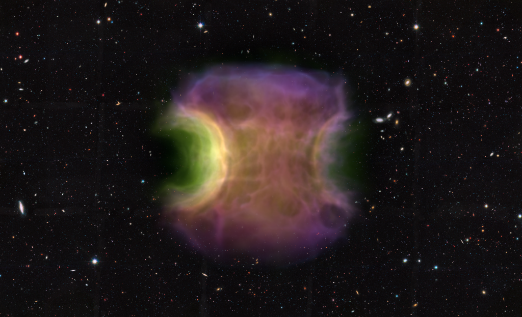
Some of the most stunning images in Astronomy and Astrophysics are the colorful illustrations published by institutions such as ESA and NASA. Most recently, the images taken by the James Webb Telescope have amazed millions of viewers. Common subjects of these publications are planetary nebulae and supernova remnants, one of which you can see in the Figure below. In a nutshell, these structures are composed of various materials, from hydrogen to various iron group elements (and even heavier elements), being scattered into space and radiating light at a frequency specific to each individual element. In case of supernova remnants, these materials originate from stellar explosions, i.e. exploding stars or white dwarfs. By which mechanism exactly these stellar objects explode is still not unambiguously established and is a topic of active research.

Here, astrophysics faces a unique problem: in contrast to other disciplines in physics, researchers cannot simply investigate things in a laboratory in a controlled and isolated environment. Instead, the universe is their laboratory, and it is hardly an isolated environment, let alone controlled. To overcome this obstacle astrophysicists rely more and more on computer simulations, moving their laboratory into the digital world. While these simulations have made impressive discoveries over the years, illustrations of these simulations rarely have the same impact as the aforementioned pictures by, e.g., the Hubble Telescope. (There exist a view notable exceptions, e.g. the images created by the Illustris-Project). Modern simulations, however, can very well be visualized to mimic the appearance of images taken by space telescopes. Here, we can use the fact that these images are, in a sense, artificial as well. To achieve their stunning appearance, scientists take many images taken in various wavelengths and overlay them, carefully fine-tuning the colors for optimal contrast. In this way they are able to highlight may interesting features in these so called color composites and achieve their breathtaking appearance. And we can do the same thing for our simulations!
(The following makes use of the simulation published by Moran-Fraile et al. (2023). In short this simulation covers the merger of a secondary helium white dwarf and a primary carbon-oxygen white dwarf which turns into a supernova after both white dwarfs explode.)
First, we load the simulation data in a uniform grid:
# Load the data on a 256 cubed grid
length, rho, xnuc_he, xnuc_o, xnuc_ni = load_data(res=256)

# Convert the abundance fractions to mass fractions
xnuc_he = xnuc_he * rho
xnuc_o = xnuc_o * rho
xnuc_ni = xnuc_ni * rho
In this case the data is Arepo data, which makes the loading of the data a bit more involved. For this reason we abbreviate this part with a load_data() function. The important part here is that we obtain density and abundance fractions on a uniform grid, as well as the physical size of the grid.
Next, we have to load the data into a yt grid:
import numpy as np
import yt
data = {
"Density": (rho, "g/cm**3"),
"He": (xnuc_he, "g/cm**3"),
"O": (xnuc_o, "g/cm**3"),
"Ni": (xnuc_ni, "g/cm**3"),
}
bbox = np.array([[-radius, radius], [-radius, radius], [-radius, radius]]) / 2
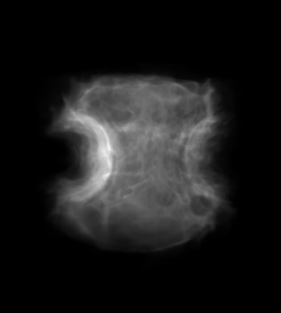
ds = yt.load_uniform_grid(data, rho.shape, 1.0, bbox=bbox, nprocs=64)This completes the loading of the data and we can proceed creating the first scene. As a basis, we use the density as a proxy for the brightness, since (at least naively) the more material we have in a particular location, the more material will be emitting light and the brighter that location will be. Here we illustrate the density using a black and white colormap, where the transfer function tf has be be manually fine tuned to cover the value range and yield nice contrast.
from yt.visualization.volume_rendering.api import Scene, create_volume_source

sc = Scene()

# Add density
field = "Density"
vol = create_volume_source(ds, field=field)
vol.use_ghost_zones = True
bounds = (1e-1, 7e1) # This has to be fine-tuned by hand

tf = yt.ColorTransferFunction(np.log10(bounds))

vol.set_transfer_function(tf)
sc.add_source(vol)
sc[0].set_log(True)

def linramp(vals, minval, maxval):
    return (vals - vals.min()) / (vals.max() - vals.min())
tf.map_to_colormap(
    np.log10(1e-1), np.log10(8e1), colormap="B-W LINEAR", scale_func=linramp
) # The ranges here also have to be fine-tuned by hand

sc[0].tfh.tf = tf
sc[0].tfh.bounds = bounds
sc[0].tfh.set_log(True)
sc[0].tfh.grey_opacity = True
sc[0].tfh.plot("transfer_function.png", profile_field="Density")
sc[0].tfh.plot("plots/transfer_function_rho.png", profile_field=field)
This part already yields us our brightness map as is illustrated below. There you can also see the transfer function which is fine tuned to cover the entire density range.
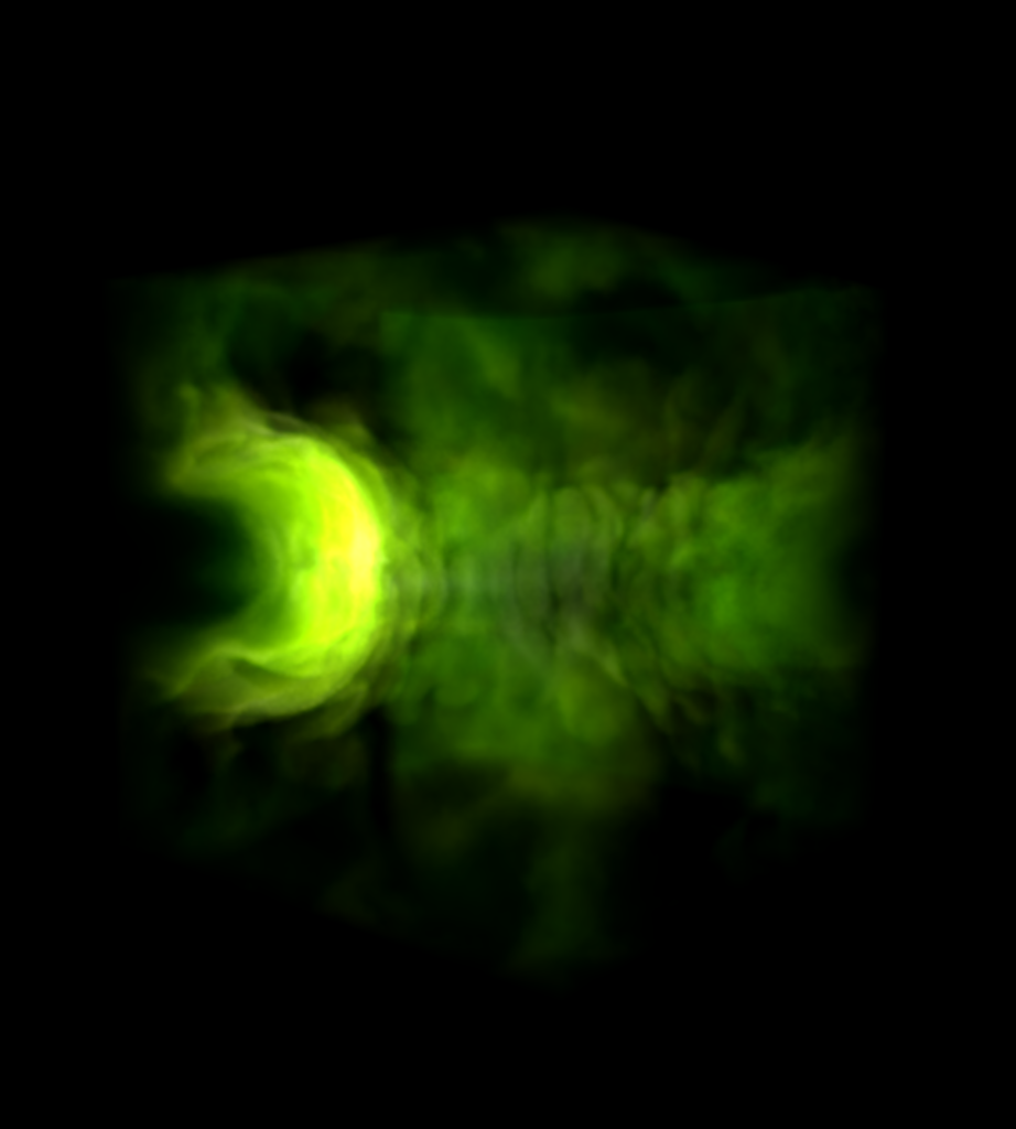
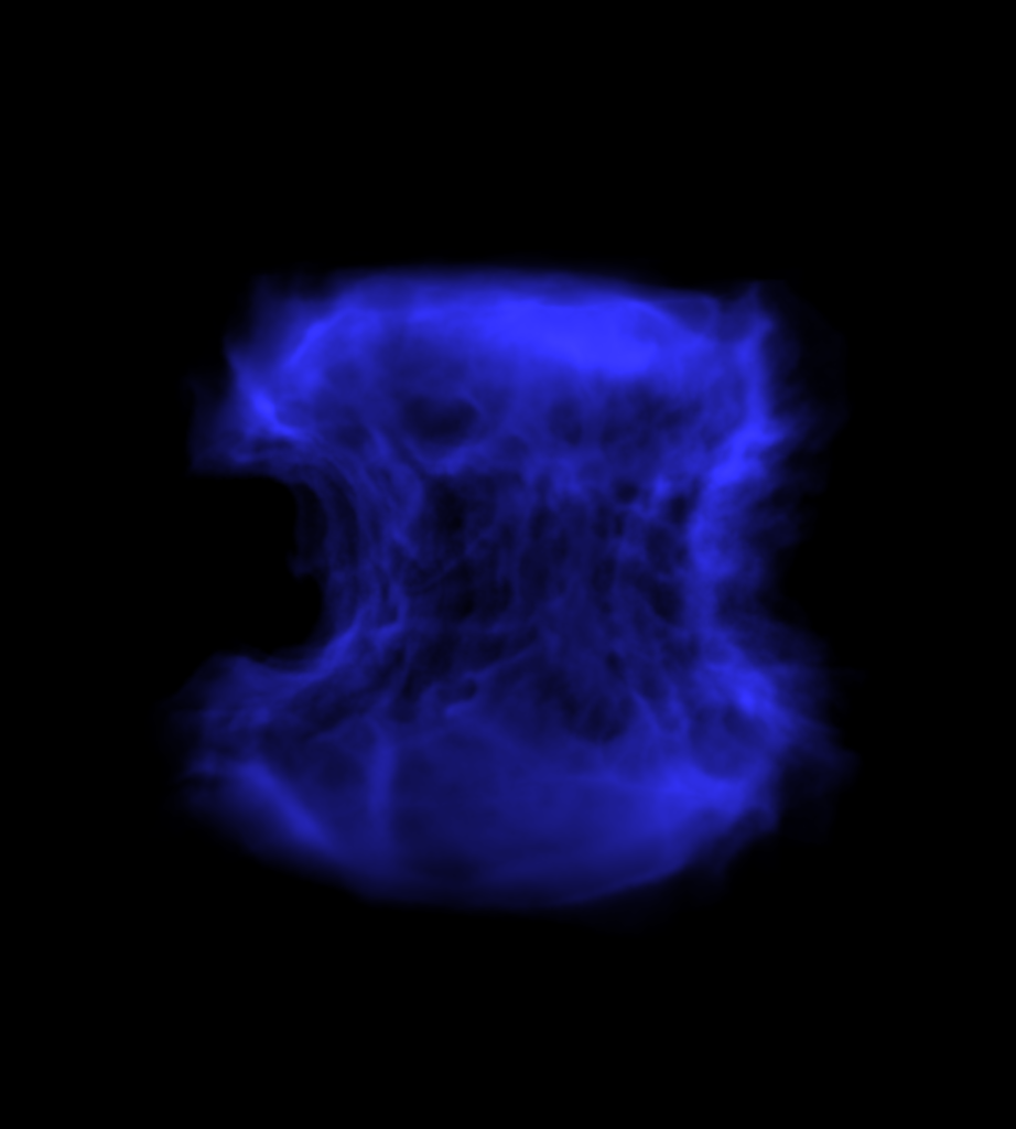
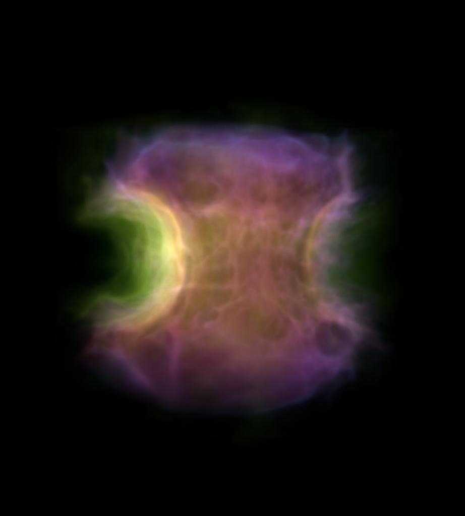
In the same way, we can now proceed to plot the various elements. Here, less is more and we only plot three different species: helium, oxygen and nickel. These species can be interpreted as a proxy for various physical regions:
- Helium: This element can only be found in the secondary white dwarf and thus these regions are mostly unburnt material of the secondary
- Oxygen: Similarly to helium, this element can only be found in the primary white dwarf and can be used as a proxy for the unburnt material of the primary.
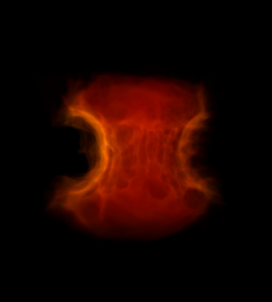
- Nickel: This material, for the most part, exists only as the product of the explosion(s). As such, we can use the nickel as a proxy for the burning regions and intensity.
Lastly, we need to make a choice for the different colors. Here, we take the colors used by, e.g., the Hubble team as a basis:
- Green → Helium
- Blue → Oxygen
- Red → Nickel
# Add He

field = "He"

vol = create_volume_source(ds, field=field)
vol.use_ghost_zones = True

bounds = (1e-2, 3e1)

tf = yt.ColorTransferFunction(np.log10(bounds))

vol.set_transfer_function(tf)
sc.add_source(vol)
sc[1].set_log(True)

tf.map_to_colormap(
    np.log10(1e-2), np.log10(3e1), colormap="GREEN", scale_func=linramp
)

sc[1].tfh.tf = tf
sc[1].tfh.bounds = bounds
sc[1].tfh.set_log(True)
sc[1].tfh.grey_opacity = True
sc[1].tfh.plot("plots/transfer_function_He.png", profile_field=field)

# Add O

field = "O"

vol = create_volume_source(ds, field=field)
vol.use_ghost_zones = True

bounds = (1e-2, 3e1)

tf = yt.ColorTransferFunction(np.log10(bounds))

vol.set_transfer_function(tf)
sc.add_source(vol)
sc[2].set_log(True)

tf.map_to_colormap(
    np.log10(1e-2), np.log10(3e1), colormap="cmyt.pixel_blue", scale_func=linramp
)

sc[2].tfh.tf = tf
sc[2].tfh.bounds = bounds
sc[2].tfh.set_log(True)
sc[2].tfh.grey_opacity = True
sc[2].tfh.plot("plots/transfer_function_O.png", profile_field=field)

# Add Ni

field = "Ni"

vol = create_volume_source(ds, field=field)
vol.use_ghost_zones = True

bounds = (1e-2, 3e1)

tf = yt.ColorTransferFunction(np.log10(bounds))

vol.set_transfer_function(tf)
sc.add_source(vol)
sc[3].set_log(True)

tf.map_to_colormap(
    np.log10(1e-2), np.log10(3e1), colormap="RED TEMPERATURE", scale_func=linramp
)

sc[3].tfh.tf = tf
sc[3].tfh.bounds = bounds
sc[3].tfh.set_log(True)
sc[3].tfh.grey_opacity = True
sc[3].tfh.plot("plots/transfer_function_Ni.png", profile_field=field)
These colors on their own already yield quite interesting images from which one can deduct many scientific insights, e.g. that helium is mostly found in the equatorial plane and oxygen mostly in the plumes above and below.
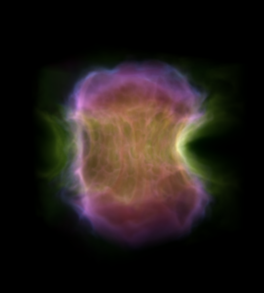
All that is left to do is to setup the camera and render the composite image!
cam = sc.add_camera(ds, lens_type="perspective")
cam.resolution = (1800, 2000)
cam.set_focus(ds.domain_center)
cam.zoom(1.2)
cam.north_vector = [0, 0, 1]
cam.position = [1.7, 1.4, 0.2]

sc.save("plots/composite.png", sigma_clip=4)
Note that many values have to be fine tuned, which can be a rather lengthy process. But the end result is definitely worth it!
If you feel adventurous, you can now take these composites and place them on a night sky image (using GIMP or similar tools) and you’ll be left with an image that looks similar to those taken by the space telescopes. Well, maybe not the latest James Webb images, but maybe some of the early Hubble images if you squint.